Next.js Blog Tutorial - Part 2
Create blog posts and navigate to them with a dropdown menu.
Starting code: https://replit.com/@buckldav/next-tut-1.
Creating Blog Folder and Files
In the pages/ folder, create a blog/ folder with two files, post1.js
and post2.js.
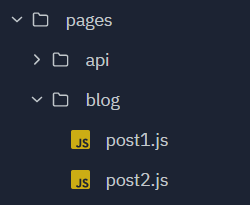
pages/
  blog/
    post1.js
    post2.js
Creating Posts
Make Post 1 like the below markup. You can choose what text goes between the tags, but be sure to pick the same tags in this example for this tutorial.
pages/blog/post1.js
import Head from "next/head"
import Image from "next/image"

export default function Post1() {
  return (
    <main>
      <Head>
        <title>My Next App | Post 1</title>
        <meta name="description" content="Generated by create next app" />
        <link rel="icon" href="/favicon.ico" />
      </Head>

      <article>
        <header>
          <h1>Post 1</h1>
          <p>October 14, 2021</p>
          <p>by David Buckley</p>
        </header>

        <div>
          <p>This is some content for my first post.</p>
        </div>
      </article>
    </main>
  )
}
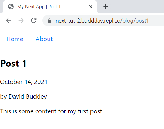
Once Post 1 is complete, copy + paste the markup and modify text for Post 2. You can navigate to
/blog/post1 and /blog/post2 in your browser to see them.
Interjection - ID selector
So far, we have been mostly using element and class selectors in CSS. Now it’s time to introduce the ID selector. ID’s can be used to identify and select a single element. Here’s an example.
<style>
  #hello {
    font-size: 60px;
    color: green;
    font-weight: bold;
    font-style: italic;
  }
</style>

<p id="hello">Hello</p>
<p>Normal Text</p>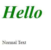
Writing inline style for this single element would look horrific and would be hard to maintain, so using an ID in this case is superior.
<p
  style="font-size: 60px; color: green; font-weight: bold; font-style: italic;"
>
  Hello
</p>
In our project, we are using an ID as part of a dropdown menu to list our blog posts in the navigation. The ID will allow us to identify the element containing the dropdown in our JavaScript and then show and hide it as appropriate.
Creating a Dropdown in our Navigation
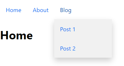
We could list all of our blog posts horizontally in our navigation, but this would not scale well. Instead, we will make a dropdown menu where all blog posts are listed. Here’s what the final product will look like:
CSS Concepts
CSS Display
We’ve already talked about CSS Display if you are in App & Web Development class at Merit.
display: block means the element takes up the full width of its parent.
display: inline-block means the element is rendered inline with its adjacent elements, but
can have Box Model styling applied to it. Note that .dropContent has
display: none;, meaning that the element is not rendered. If the element has the classes
dropContent and show, the display: block rule on the
show class overrides the display: none, thus rendering the dropdown menu on the
screen. That’s why the JavaScript function dropdown() in our Nav component toggles the
show class.
CSS Position
By default, elements have position: static, meaning they are rendered one after another.
position: relative and position: absolute can be used together to render
elements on top of the static flow (like our dropdown menu).
<parent style="position: relative">
  <child style="position: absolute" />
</parent>
If these two position rules are used like in the example above, the child element will be rendered below the parent element but on top of the rest of the page.
More Dropdown Examples
Pseudo Selectors
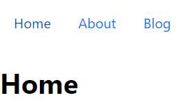
To finish things off, let’s add some pseudo selectors to our navigation CSS. Pseudo selectors allow for us to change the style depending on the state of the element.
The :hover pseudo selector is triggered whenever the mouse hovers the element.
.nav a:hover,
.nav button:hover {
  color: #0053b3;
}
The :focus and :active pseudo selectors are for elements that have been clicked on
(like our dropdown button).
.nav a:hover,
.nav button:hover,
.nav button:focus,
.nav button:active {
  color: #0053b3;
}
Summary
In this part, we created some blog post pages, add our first bit of JavaScript logic to a component, and learned some CSS tricks to help enhance our navigation.
Finished code: https://replit.com/@buckldav/next-tut-2